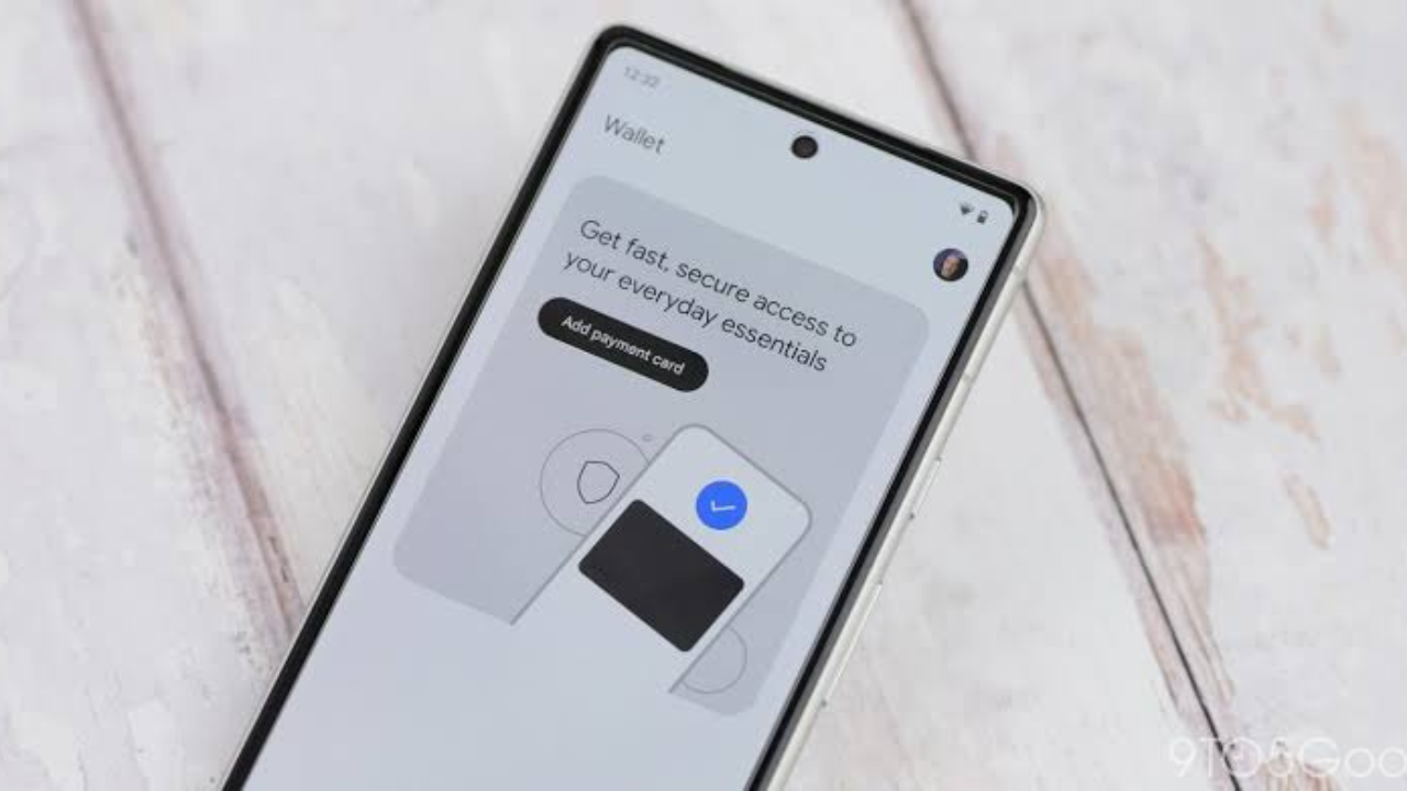
Google is rolling out a new design for passes inside Google Wallet on Android. The biggest change is easy to spot: an opened pass can now use its own color across the full screen instead of appearing as a smaller card on a plain background.
The update is mainly a visual change, but it gives tickets, loyalty cards, memberships and other Wallet passes a much more noticeable look. The rollout is happening gradually, so not every Android user will see it yet.
Google Wallet Passes Now Fill the Screen
Previously, a Google Wallet pass appeared as a card sitting inside the Wallet interface. The area around the card normally used a neutral background, which made the pass look more like a digital version of a physical card.
The new design takes a different approach. When a supported pass is opened, its background color can spread across the entire screen. Other parts of the interface are also tinted to match the pass, creating a more unified appearance.
This means the color chosen for a pass becomes much more important. A colorful airline ticket, store loyalty card or event pass can now make much more of the phone’s screen match its branding.
What Has Changed in the New Design?
The update changes how an individual pass looks after it has been opened. It does not mean that users need to add their cards or tickets again.

The main differences can be summarized as follows:
| Feature | Older Google Wallet view | New Google Wallet view |
|---|---|---|
| Pass background | Pass shown inside a separate card | Pass color can fill the screen |
| Interface | Mostly neutral around the pass | Interface elements are tinted to match |
| Overall appearance | Card-like | Full-screen and more visual |
| Existing passes | Already supported | Continue to work with the new presentation |
| Rollout | Existing design | Gradual server-side rollout |
The new design is being delivered through a server-side change. That means simply installing the newest Wallet version does not guarantee that the new interface will appear immediately.
Users Can Temporarily Return to the Previous View
Google has also included an option that lets users switch back to the older presentation. The option is described as “Switch to previous view.”
This gives users a way to return to the more familiar design if they do not like the new full-screen appearance. However, the current option may only be temporary, and it could disappear in a later version of Google Wallet.
The setting is useful during the transition because Google is changing the visual experience for a large number of different pass types. Some users may prefer the older, simpler layout while they get used to the new one.
The Update Is Rolling Out in Stages
One important detail is that this is not a normal update that reaches everyone at exactly the same time.
Google has started the rollout with Google Wallet version 26.32.962917069, but the new interface is controlled on Google’s side. As a result, two phones running the same Wallet version can show different pass designs.
Users who do not see the new design should not assume that something is wrong with their phone. The rollout may simply not have reached their account or device yet.
Google’s current Wallet documentation also shows that the company is continuing to update how passes are presented and designed. Its guidance covers elements such as background colors, logos, hero images and information modules.
Why the Full-Screen Design Matters
At first glance, the update may look like a simple cosmetic change. But the new layout can make important information easier to recognize when a user opens a pass.
For example, a boarding pass can stand out more clearly when its brand color covers the screen. A loyalty card can also be easier to identify without having to look closely at a small card among other Wallet items.
The change also gives businesses more room to make their passes visually recognizable. Google says pass backgrounds can be set using a background color, while its Wallet guidelines also support hero images and other visual elements.
Businesses May Need to Check Their Wallet Passes
The redesign is especially relevant to companies that issue Google Wallet passes. A design that looked fine inside the old card layout may look different when its colors and images occupy more of the screen.
Google’s current design guidance recommends careful use of background colors and images. For example, it warns against extremely bright colors because they can make text harder to read. The platform can also use a dominant color from a pass logo when a background color is not provide.
Businesses that issue digital tickets, membership cards or loyalty passes therefore have a reason to review their existing designs.
- Background colors now have a much bigger visual effect.
- Logos need to remain clear against the new layout.
- Large images can become more noticeable than they were in the old card view.
- Important pass information still needs to be easy to find and read.
The Change Does Not Replace the Wallet App Redesign
It is also important to separate this update from Google’s earlier redesign of the main Wallet app.
The Wallet home screen and the individual pass view are two different parts of the experience. Google has already been changing how users find and organize their passes, including improvements to search and ways to keep selected passes easier to access. The latest update focuses specifically on what happens after a user opens an individual pass.
So, the new full-screen appearance is not simply a new home screen. It changes the detailed view of the ticket, card or other pass itself.

Existing Passes Do Not Need to Be Reissued
The visual redesign does not mean that users need to delete and add their passes again. The change affects how the pass is displayed rather than how the pass is stored or issued.
Google Wallet supports many types of digital items, including payment cards, loyalty cards, tickets, transit passes and other passes.
For users, the biggest change is therefore what they see when they open an existing item. The pass remains in Wallet, while its presentation can change as Google’s new design reaches the device.
What Android Users Should Expect
The new full-screen pass design is gradually becoming available to Android users. Some people may already see it, while others may continue to see the older card-based design for now.
If the new interface has not appeared yet, there is no clear need to reinstall Wallet or replace existing passes. Because the change is being rolled out from Google’s servers, availability can depend on when Google’s rollout reaches a particular account or device.
The temporary option to return to the previous view also gives users some control during the transition, although Google may remove that option later.

Google Wallet Gets a More Modern Pass Experience
Google’s latest Wallet change gives individual passes a much larger visual presence on Android. Instead of keeping a pass inside a smaller card surrounded by neutral space, the new design can use the pass’s own color across the entire screen and tint the interface to match.
The update is still rolling out, so the experience will not be identical for every Android user right away. For now, the main change is visual rather than functional, but it marks another step in Google’s broader effort to make Wallet passes easier to recognize and more closely connected to the brands and services behind them.